
Most surveys don’t fail because of low response rates.
They fail because the data never turns into action.
Teams collect hundreds—sometimes thousands—of survey responses, only to end up with dashboards full of numbers and no clear answers. Charts look impressive, but important questions remain unanswered: What actually needs fixing? Which responses matter most? And what should we do next?
This is where survey data analysis often breaks down. Without the right approach, patterns stay hidden, results get misinterpreted, and decisions are made on assumptions instead of evidence. Even small mistakes—like ignoring response clustering or analyzing all respondents as one group—can lead to misleading conclusions.
This is where you need clear, practical survey data analysis examples.
Seeing how real businesses analyze survey responses—by grouping data, testing assumptions, and connecting feedback to decisions—makes the difference between reporting results and driving change. When done right, survey analysis turns raw responses into insights that improve customer experience, guide product priorities, and strengthen business performance.
In this guide, we’ll walk through practical survey data analysis examples used by successful teams, along with step-by-step methods you can apply to your own surveys.
Types of Survey Data You’ll Work With
You need to know your survey data types before jumping into analysis techniques. The right analysis approach depends on the kind of data you collect.
Quantitative vs qualitative data
Quantitative data refers to numbers you can measure and analyze statistically. Numbers like ratings, rankings, and scores give you solid metrics to track. This data lets you run mathematical calculations and statistical tests, which helps you spot trends and patterns in large datasets.
Qualitative data has non-numerical information such as written comments, interview responses, and observations. While this data proves harder to analyze at scale, it helps you learn about the "why" behind people's behaviors and opinions. Today's analysis tools can automatically detect sentiment in qualitative responses and identify themes and emotions.
Closed-ended vs open-ended questions
Closed-ended questions give respondents specific options to choose from (yes/no, multiple choice, rating scales). The data from these questions is easy to calculate and compare. People tend to answer these questions more often since they take less time and effort.
Open-ended questions let people answer in their own words. These questions need more effort to answer and analyze, but they often reveal surprising insights that closed questions might miss. The responses can also bring up new ideas and views you hadn't thought about when creating your survey.
Categorical, ordinal, and scalar data explained
Categorical data (nominal data) groups responses without any order—like industry types, departments, or locations. This type of data works best when you want to analyze segments and compare responses between groups.
Ordinal data uses categories that follow a ranking (poor/fair/good/excellent), but the space between values might not be equal.
Scalar data (interval or ratio data) uses numbers with equal spacing—like age, income, or rating scales. You can run complex statistical analyzes with this data type, including correlations and regressions that show how variables relate to each other.
Knowing these data types helps you create better surveys and pick the right analysis methods to get meaningful results.
If you’re still designing your survey, understanding different survey question types can help you collect cleaner data that’s easier to analyze.
How to Analyze Survey Data Step-by-Step
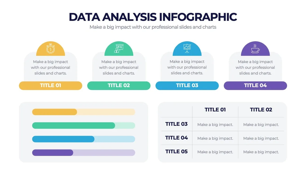
Image Source: Slidenest
The quickest way to turn survey responses into applicable information needs a well-laid-out approach. Let me break down five steps that will help you analyze your survey data.
Define your research goals
Your survey analysis needs clear objectives. You should identify the questions you want to answer and decisions your data will shape. A clear definition of your research objectives at the start prevents issues during analysis. Your main goal should cover measurement targets, required data categories, target audience details, and planned comparisons.
Segment your audience to learn more
Your data reveals critical differences in points of view when divided into meaningful subgroups. Customer groups form based on location through geographic segmentation, personal traits like age or income through demographic segmentation, psychological characteristics through psychographic segmentation, and actions through behavioral segmentation. The data shows hidden patterns when broken down by demographics—gender, age, education level, income, or location. Multiple segmentation methods combined help you understand your customers better.
Use cross-tabulation and filtering
Cross-tabulation (crosstabs) shows how categorical data variables relate to each other. This method makes data interpretation easier by dividing information into subgroups and showing percentage changes across categories. Data filters are a great way to get detailed insight. To cite an instance, filtering by demographics shows response patterns across different groups. These approaches help you spot relationships between variables and identify result drivers.
Apply statistical tests to check significance
Statistical tests tell you if data differences show real effects or random changes. A "statistically significant" result means your findings matter. T-tests work best to compare two groups while ANOVA suits three or more. These methods verify meaningful trends and explain what the data means alongside other datasets.
Visualize trends with charts and dashboards
Results dashboards make your survey findings clear and compelling. Each question type needs specific visualizations: bar charts compare categories, pie charts show proportions, line graphs track time trends, and scatter plots reveal variable relationships. Your dashboard tells a better data story when you match colors, chart types, and titles to your brand. A good dashboard helps you spot challenges, monitor performance indicators, and make analytical decisions.
Having a clear process matters—but having the right tools to apply it consistently is what makes survey analysis scalable.
Try SurveySparrow for free today to see if it is the right tool for you.
14-day free trial • Cancel Anytime • No Credit Card Required • No Strings Attached
8 Survey Data Analysis Examples Businesses Actually Use
These survey data analysis examples show not just what to measure, but how businesses interpret results and act on them.
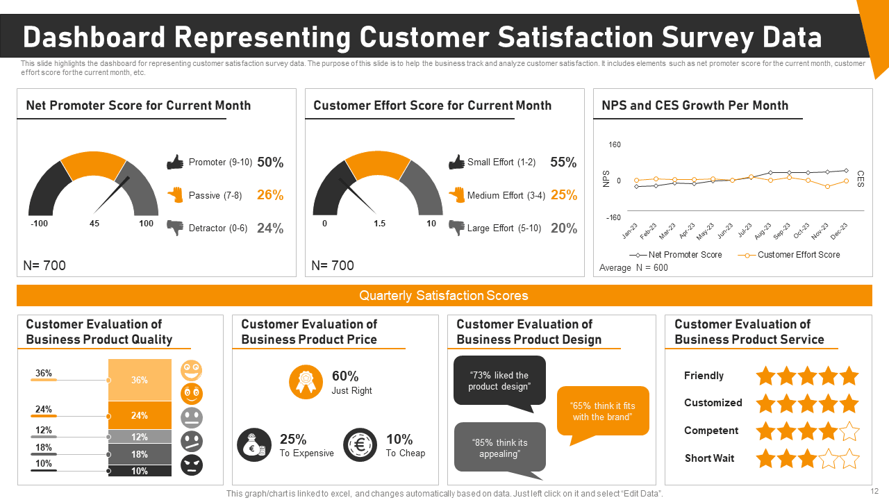
Image Source: SlideTeam
Let's get into how businesses use survey analysis to create real value. These eight survey data analysis examples show how companies turn feedback into action.
1. Customer satisfaction (CSAT) analysis
Companies use CSAT surveys to track satisfaction with products, services, or interactions through 1-5 rating scales. They calculate scores by taking the percentage of positive responses (4-5 ratings) and dividing it by total responses. The results help them spot satisfaction trends, find problem areas, and make better customer experiences.
For more on designing effective satisfaction surveys and proven question examples, see this guide on customer satisfaction survey questionnaires.
Analysis example:
Teams segment CSAT scores by touchpoint (support, onboarding, checkout) to identify where satisfaction drops. This helps prioritize fixes in specific stages of the customer journey instead of treating satisfaction as a single average score.
CSAT analysis works best when customer satisfaction surveys are designed with clear touchpoints and consistent rating scales.
2. Net Promoter Score (NPS) breakdown
NPS shows customer loyalty by asking "How likely are you to recommend us?" with ratings from 0-10. The responses put customers into three groups: Promoters (9-10), Passives (7-8), or Detractors (0-6). The NPS comes from subtracting the percentage of Detractors from Promoters. Good scores start above 0, excellent scores above 50, and outstanding scores above 70 by global standards.
For hands-on calculation as you analyze loyalty scores, try the Net Promoter Score calculator to compute and interpret your NPS quickly and accurately.
Analysis example:
Companies cross-tab NPS scores with open-ended comments to uncover why customers promote or criticize the brand, turning a single metric into actionable themes.
3. Product feature prioritization
Product teams use feature prioritization surveys to put resources where customers see the most value. These surveys help separate "must-have" features from "nice-to-have" ones. Teams can use ranking questions, MaxDiff scaling, or budget allocation exercises. The results help create roadmaps that line up with what customers want.
Analysis example:
Responses are analyzed by user segment (new users vs power users) to avoid prioritizing features that only matter to a vocal minority.
4. Employee engagement survey analysis
Employee engagement surveys measure how satisfied workers are across departments, roles, and locations. A good analysis breaks down data by demographics, finds patterns, and mixes number-based metrics with written responses. Organizations can then find specific issues, spot trends, and create targeted solutions.
Analysis example:
HR teams segment engagement data by role and tenure to identify where burnout or disengagement is highest, enabling targeted interventions instead of company-wide assumptions.
These survey data analysis examples highlight how structured analysis leads to clearer insights across teams.
Want to analyze survey data faster without losing important details?
14-day free trial • Cancel Anytime • No Credit Card Required • No Strings Attached
5. Event feedback interpretation
Event surveys capture what attendees think, but responses can show bias. People often focus too much on recent experiences or negative moments. Smart organizers use multiple metrics and time their surveys well—during events for quick reactions and after events for deeper thoughts.
Analysis example:
Organizers compare in-event feedback with post-event surveys to separate emotional reactions from considered opinions, helping improve future events more accurately.
6. Market research segmentation
Market segmentation splits customers into groups with shared traits. Good segmentation surveys look at demographics (age, income), psychographics (values, interests), location, and behavior. Companies can then create targeted marketing and products that match each group's needs.
Analysis example:
Survey data is clustered to reveal distinct customer personas, allowing marketing and product teams to tailor messaging and offerings for each segment instead of using one generic approach.
7. Brand perception tracking
Brand tracking surveys measure how people know, see, prefer, and stay loyal to brands. Regular checks every six months help catch early signs of dropping awareness or loyalty. Marketing teams use these insights to see how well their campaigns work, check against competitors, and adjust their strategy.
Analysis example:
Teams compare brand perception scores before and after campaigns to understand which messages actually change perception and which fail to resonate.
8. Website usability feedback analysis
Website teams use usability surveys to check how easy their sites are to use, navigate, and understand. They focus on design appeal, mobile friendliness, loading speed, and checkout process. Teams place these surveys at key points in the user's path to find and fix problems quickly.
Analysis example:
Feedback is analyzed alongside behavioral data (drop-off points, session duration) to pinpoint exactly where users struggle and what changes will have the biggest impact.
Best Tools for Survey Data Analysis
The right tools help teams apply survey data analysis examples consistently across surveys, teams, and time periods.
SurveySparrow for end-to-end survey analysis
SurveySparrow delivers up-to-the-minute secure data capture with powerful filtering capabilities. The platform's CogniVue AI feature turns voluminous data into meaningful insights and helps you spot patterns and trends. You'll find practical features like reputation management in 100+ platforms. The automated reporting system sends insights to your inbox at scheduled times.
Turn survey responses into actionable insights without manual analysis.
14-day free trial • Cancel Anytime • No Credit Card Required • No Strings Attached
Qualtrics for enterprise-grade insights
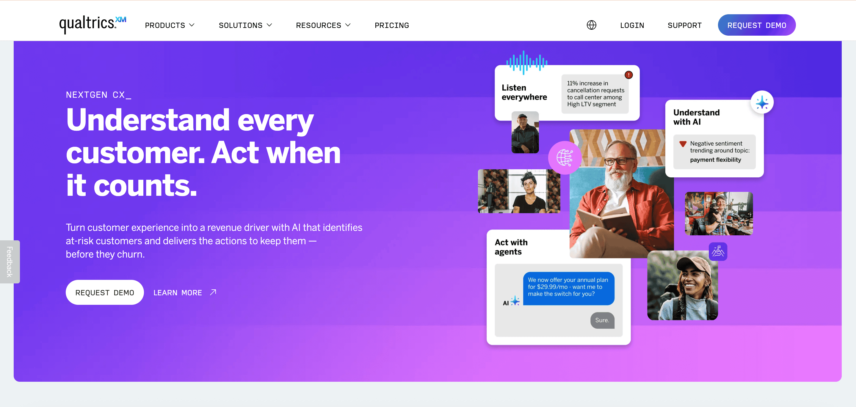
Qualtrics handles over 1.3 billion surveys yearly for 20,000+ brands and excels at enterprise-level research. The platform uses a drag-and-drop interface that manages everything from simple feedback questionnaires to detailed research projects. Your feedback comes from more than 125 data sources, including social media and online reviews.
Thematic for open-ended response analysis
Thematic turns qualitative responses into practical insights through pattern recognition and theme identification. The AI algorithms identify and categorize themes faster while calculating their frequency, relevance, and sentiment.
Excel and Google Sheets for simple analysis
These available tools come with built-in statistical functions that work perfectly for numerical survey responses. Excel's COUNTIF, AVERAGE, and CORREL functions help calculate trends, while pivot tables make cross-tabulation analysis possible.
AI tools for sentiment and theme detection
Modern AI solutions automate open-ended response categorization by classifying text as positive, negative, or neutral. Word clouds, emerging themes, and interactive visualizations help you learn about relationships between topics.
The difference between collecting survey data and learning from it comes down to how confidently you analyze and act on responses.
Conclusion
Good survey data analysis turns overwhelming information into business advantages. This piece shows how analyzed survey data helps improve customer satisfaction, product development, employee involvement, and marketing campaigns.
You can make your data work by being organized and analytical. Your survey results become more valuable when you set clear goals, segment your audience right, and use proper statistical methods.
The right analysis tools help you learn from data quickly. To name just one example, SurveySparrow's live analytics and AI-powered CogniVue feature spot patterns instantly instead of taking days to process responses manually. This lets you act on feedback faster and improve your products, services, or processes quickly.
Each survey type needs its own approach to analysis. Track customer satisfaction metrics regularly. Feature surveys need careful segmentation to understand what different user groups want. These survey data analysis examples show how companies solve real-life problems and make measurable improvements.
Your survey data holds answers to questions you haven't even asked yet. The right framework and tools will help you find insights that give you an edge over competitors. Turn raw survey responses into practical business insights—and make decisions with confidence.
Ready to apply these survey data analysis examples to your own surveys?
14-day free trial • Cancel Anytime • No Credit Card Required • No Strings Attached


