Survey & Feedback
How to Make a Pie Chart in Google Sheets from Google Forms Data: Complete 2025 Guide
Master creating compelling Google Forms pie charts in Google Sheets with this comprehensive guide, revealing step-by-step techniques for transforming survey data into powerful visual insights.

TRUSTED BY BEST-IN-CLASS BRANDS


Watch Customer Stories
Are you collecting valuable survey data through Google Forms but are struggling to make sense of the results that you got? Turning your responses into visual formats like pie charts in Google Sheets can make raw numbers into actionable insights.
In this step-by-step tutorial, we’ll look at how to make a pie chart in Google Sheets from your Google Forms responses, along with tips you can use for maximizing the impact of your data visualization.
We also show you an easier way to create pie charts from your survey data. Here’s what we’ll cover:
- What Are Pie Charts?
- How To Create A Google Forms Pie Chart
- How to Create Better Pie Charts with SurveySparrow
What Are Pie Charts and When Should You Use Them?
Before we talk about how to create a Google pie chart, let’s understand what pie charts are and when they’re most effective.
Just a crisp definition!
A pie chart is a circular graph divided into slices (like pieces of a pie) to basically show numerical proportions. Each slice represents a category of data, and the size of each slice corresponds to the quantity it represents.
Simply put, a pie chart represents information we seek in a structured manner to simplify decision-making. From school to conference rooms, it is used everywhere.
When to use pie charts:
When showing proportional parts of a whole (percentages adding up to 100%)
When you have a relatively small number of categories (ideally 5-7)
When one or two categories are significantly larger than others
When you want to emphasize a single category’s proportion against the total
When NOT to use pie charts:
When comparing changes over time (use line charts instead)
When you have many small, similar-sized categories (use bar charts)
When precise comparisons between categories are needed

Nonetheless, it’s still a pivotal piece of indicator for in-depth analysis. And for that reason alone, we’ll see how to create pie charts using Google Sheets from your Form responses.
How to Make a Pie Chart in Google Sheets from Google Forms Data
Creating a Google Forms pie chart involves four steps. Let’s go:
Step 1: Create and Send Your Google Form
Go to Google Forms and create a new form or open an existing one.
Add your questions, focus on which types works well with pie charts:
Multiple choice questions
Dropdown questions
Checkbox questions (for multiple selections)
Style your form with an appropriate theme and header image.
Click the “Send” button to distribute your form via email, link, or social media.
Pro Tip: For best results with pie charts, use question types that have clear, distinct options. Open-ended questions are not the best option for pie charts.
Step 2: Access Your Google Forms Survey Data in Sheets
Once you have sufficient responses for data visualization:
Go to ‘Responses’ section on your Google Form
Look for the Google Sheets icon in the top-right corner of the Responses section.
Click on “Create a new spreadsheet” or select an existing spreadsheet where you want to send the data.
Google will automatically export all your form responses to the sheet.
Pro Tip: Set up automatic response collection in Google Sheets from the beginning so your data is always up to date for visualization.
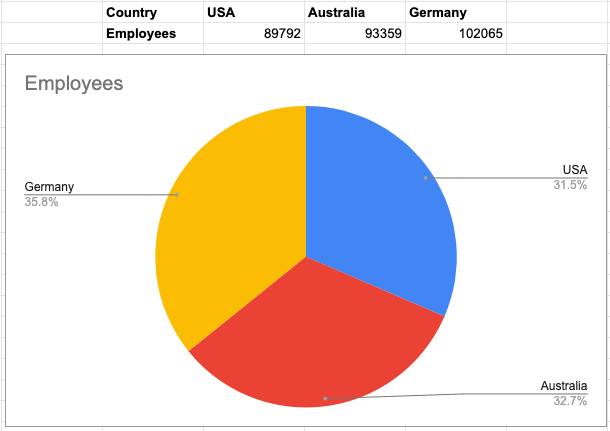
Step 3: Select Data for Your Google Pie Chart
Now that your data is in Google Sheets:
Find the column containing the data you want to visualize with a pie chart. For example, "Which country are you from?". Highlight the column.
There are two ways to prepare your data for a pie chart:
Method A: Use summary data
If your responses aren’t already summarized, create a summary using the COUNTIF function:
In a new area of your sheet, list each possible response in column A
In column B, use =COUNTIF(ResponseRange,"Option") to count occurrences
Select both the label column and the count column
Method B: Use raw response data
Simply select the entire column of responses
Google Sheets will automatically count and categorize the responses
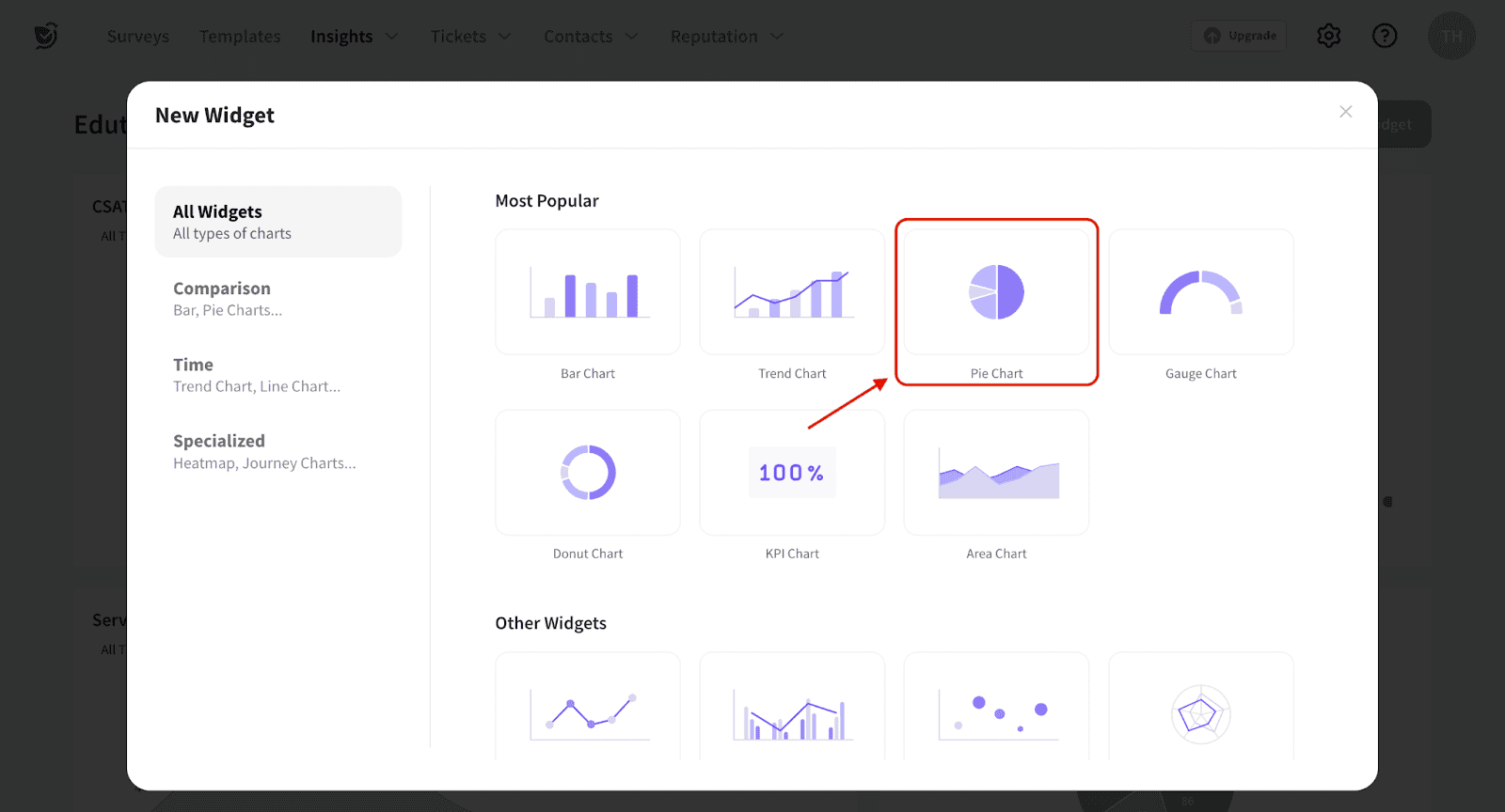
Step 4: Create and Customize Your Pie Chart in Google Sheets
Now for the fun part—creating your Google pie chart:
With your data selected, click “Insert” in the menu bar
Select “Chart” from the dropdown menu
The Chart Editor will open on the right side of your screen
Under the “Chart type” dropdown, scroll to the “Pie” section
Choose your preferred pie chart style (regular or 3D)
For customizing your pie chart:
In the Chart Editor, click on the “Customize” tab
Here you can modify:
Chart style: Colors, background, border, font
Pie chart: Slice labels, donut hole size (for donut charts)
Chart & axis titles: Add meaningful titles and legends
Step 5: Share and Export Your Google Forms Pie Chart
Once you’re good to go with your pie chart:
To share the interactive chart:
Click the three dots in the top-right corner of the chart
Select “Publish chart”
Choose your publishing options and click “Publish”
To export as an image:
Click the three dots in the top-right corner of the chart
Select “Download as”
Choose your preferred format (PNG, PDF, or SVG)
Ta-da!
Creating Better Pie Charts with SurveySparrow
While creating a Google Form pie chart through Sheets works, it involves multiple steps and does lack advanced visualization features. SurveySparrow offers a more streamlined solution just for this, with easy and engaging data visualization tools built directly into the platform.
Click below to see how we make data visualization super-simple.

Now, let us show you choosing SurveySparrow for your next survey can simplify your work while bringing the intended results:
1. Better Data Visualization
Creating pie charts using Google Forms was a tedious process, right? Plus, exporting that data is a pain.
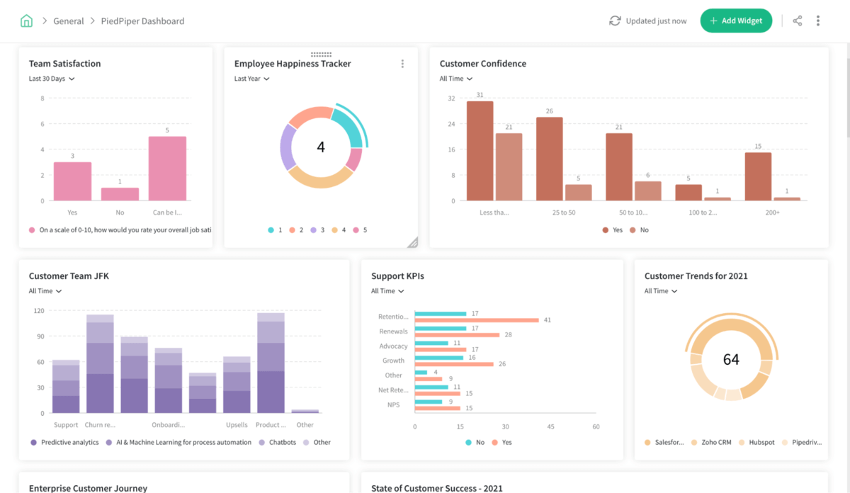
With SurveySparrow’s Executive Dashboard you can visualize all your survey data effortlessly, in one place. This includes:
- Comparing, correlating & visualizing survey data
- Slicing & dicing all survey data with multiple dashboards
- Creating and customizing widgets that represent information accurately
Suggested reading: How to create your Executive Dashboard on SurveySparrow.
Here's an example of what your dashboard will look like.
Click here to get SurveySparrow’s Executive Dashboard Tutorial!
2. Omnichannel Reach
With SurveySparrow's omnichannel feedback, your surveys can reach people on any platform – from social media to QR codes.
Our survey tools give you in-depth insights across channels, so you can make well-informed decisions with confidence.
3. Seamless Survey Experience
With its engaging and beautiful survey templates, you can easily and quickly make the survey-taking experience fun.
This leads to better responses in terms of quantity and quality, which means more accurate data for you to visualize.
4. Diverse Survey Types
SurveySparrow offers classic surveys, conversational forms and single page forms. Plus, with 20+ question types, you can tailor your surveys to get exactly the feedback you need.
What's more, you get offline surveys as well on our mobile app. This opens up new avenues for data collection.
5. Advanced Pie Charts
SurveySparrow's pie chart widget lets you quickly turn survey results into clear, easy-to-read graphs. These pie charts update automatically as more people respond, so you always have the latest data.
Here’s how to create pie charts with SurveySparrow:
Log in to your SurveySparrow account (or start a free trial)
Open your survey results
Click on “Reports” or “Analytics”
Select the question you want to visualize
Choose “Pie Chart” from the visualization options
Customize colors, labels, and other design elements
Download or share your visualisation
Here's a detailed step-by-step process on how to create a pie chart on SurveySparrow. Sign up below to import your contacts and start creating your own.

Explore how SurveySparrow can transform your feedback process.
TRUSTED BY BEST-IN-CLASS BRANDS
You can customize the charts to fit your style, share them with others, and save them for reports or presentations. Plus, they support nine survey question types compared to just two in Google Forms.
Whether you're comparing different groups of data or just looking at overall results, SurveySparrow makes it simple to analyze and present your findings.
Is Google Forms The Best Survey Software?
No!
Ok, so you know the answer. But stating reasons are crucial. Because Google Forms has worked satisfactorily for a long time, although… it’s not perfect. It has some significant drawbacks that you should be aware of.
In the past, users of Google Forms weren’t impressed by the lack of features for conducting a crucial survey, but there are other areas of shortcomings, too. Here’s what we’re talking about;
- First of all, there is no difference in the available features based on a G-Suite subscription. You get the same things in Google Forms whether you’re paying or not.
- With Google as your poll app, it's hard to create vibrant polls that get immediate attention. The features required just aren’t there.
- The analysis is very superficial and, as you already read, extremely time consuming with Google Forms. You have to export responses to Google Sheets for even the basic graphs and analysis. That’s the biggest time-waster.
- There’s no option to accept payments in surveys conducted using Google Forms.
- Google Forms has terribly limited options for customization. So customizing your survey’s look isn’t easy.
- Yes, Google Forms offers conditional logic (for free!), but it’s limited to only a few question types. Isn’t that a deal-breaker?
You probably know all these shortcomings. So our question is, are you willing to spend some bucks on a perfect survey tool for your business needs?
If yes, the next section is for you!
Time For A Decision
Now that you know how to make a pie chart in Google Sheets from your Google Forms data, as well as the advantages SurveySparrow offers, it’s time to decide:
Google Forms + Sheets: Good for basic surveys and simple visualizations when budget is the primary concern.
SurveySparrow: Ideal for businesses that need professional survey experiences, advanced data visualization, and actionable insights without the extra steps.
For casual, infrequent surveys, Google Forms might meet your needs. But if data visualization and analysis are crucial to your decision-making process, SurveySparrow provides a far more powerful and efficient solution.
Ready to elevate your survey analysis? Try SurveySparrow free for 14 days and experience the difference yourself.
P.S. – For any help, talk to us.
Watch Customer Stories


