


Data is an incredible resource – there’s no doubting that. No one can argue with cold, hard statistics, so wanting to turn this to your advantage is only natural.
However, most of your audience, your employees, partners or clients, won’t get a complicated graph or diagram or reels of numbers and percentages. They may even be unable to decipher them, leading to accessibility issues with your data resources. So how can you fix this?
By turning survey data into narratives, that’s how.
When you learn to tell stories with your data, you create a more reader-friendly resource. Not just that, you’ve also found a simple way to win over anyone, from boardroom audiences to your next big client. But how can you do this? Using the tools available with SurveySparrow, this guide will walk you through the basics of crafting that intimidating pile of data into a compelling story.
The 4-Step Process to Turn Survey Data into Compelling Narratives
Let’s be real, turning numbers into engaging stories isn’t magic – it’s a strategic process that anyone can master. Follow the four-step framework to get a foolproof way to tell the narrative.
Step 1: Be Selective and Concise with your Data Points
Now, this might sound simple but mind you – being selective and concise is one of the most essential steps to turning survey data into narratives.
“If you’re doing data collection right, then you probably have a lot of data on your hands, and that’s great. But not for the reason that most people think,” states Valorie Reyes, a tech writer at Ox Essays and AustralianHelp. “Since you don’t need lots and lots of data; you need to be able to pick the best data that you have and then turn that into something that you can use.”
Luckily, you don’t need to painstakingly comb through all that data to spot the interesting nuggets. Instead, SurveySparrow’s features like real-time reporting and question-level analysis automatically help you get top-level insights.

A: Get Real-Time Insights with Live Reports
Real-time reporting can help you get up-to-the-minute data on the survey performance. For example, real-time survey reporting should give you an overview of the visits as the survey happens. It should also show the number of completions, the completion rate, and the average time to finish the form.
This view helps you quickly find the data points which are gathering the most response which is one of the important indicators of what matters to your audience.
Related: How to monitor the survey performance in SurveySparrow
B: Zoom in with Question-Level Analysis
The next thing in a survey data storytelling process is to look at the responses to each question. So, assuming that each question measures a different metric, this will help you categorize the answers for each metric.
For example, say you ask your employees to rate how happy they are at work on a scale of one to five. First, you can analyze the number of responses and response percentage for each answer option. Then, you categorize them accordingly. E.g., 50% of employees are happy at work. This helps you to identify the threads that weave the story from your data points.
Related: Analyzing responses at the question-level in SurveySparrow

Step 2: Apply Strategic Data Filters
Adding onto that, if you’re collecting data from any sort of survey, then you’ll likely want to use a filter. Not every survey result will be useful, and some may actively ruin the point you’re trying to make.
For example, if you only want relatively optimistic data, then using a filter to work through the overly negative statistics will work in your favor. This will still give you enough data at the end to work with.
Many online survey tools provide filters if you want to use one. But if you’ve created your own survey, then hiring someone to work through the data for you would also count as a filter and be beneficial.
Related: How to use advanced report filters and hidden questions
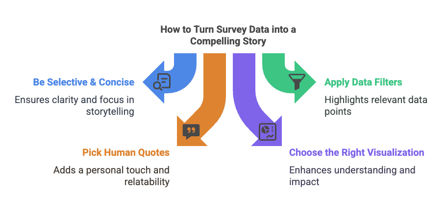
Step 3: Pick Suitable Quotes
Numbers just tell one part of the story, but human voices are what brings data to life. Adding quotes is a great way to go about. Obviously, this won’t work if your survey excludes open-ended questions where participants write their own responses. So, if this isn’t you, then consider putting some into your survey. Open-ended responses can offer unthought-of perspectives, and a single quote could be the make-or-break point for the story you’re trying to create.

“Even though many open-ended answers will be simple and unusable, or even just empty, you will almost always get a few gems,” says Matilda King, a survey analyst at Academized and Paper Fellows. “So it’s worth going through your responses to pick out just one or two quotes which you can use in presentations, meetings, or even arguments, to be honest!”
Human feedback is such a valuable piece of data. So make sure that you find something to use in the narrative that you’re trying to create. And hold onto it because it’s such a fantastic resource.
Related: How to categorize responses based on sentiments
Step 4: Choose the Right Visualization Format
Now you’ve got the data you need and included a quote or two to back it up. But how are you going to create a visually appealing resource to help turn survey data into an engaging narrative?
Well, there are several options available for you.

A: Spot the pattern with a Data Dashboard
Survey dashboards tell your narrative in a visually appealing way. First, you can select the charts you want to show and choose the metrics to compare. Then, you can arrange them as widgets in one place, exactly like the dashboard of a car.
Related: How to use the Executive Dashboard in SurveySparrow
B: Generate Individual Question Reports
Suppose you want to go beyond the top-level results and summarize the responses at the question level. You can do that by downloading the individual report for that question.
These focused visualizations help you:
Isolate critical data points
Highlight specific patterns or anomalies
Create targeted mini-narratives within your broader story
Related: How to download question-wise reports

C. Visualize Text Data with Word Clouds
Word clouds are super helpful for compiling lots of short quotes and theme words. They look stunning when complete and provide a human touch to the numbers at your disposal.
They:
Compile common themes from text responses
Create visual representations of frequency
Add a human perspective to your quantitative findings
Show patterns that you might have missed in raw text analysis
You can test out SurveySparrow’s wordcloud feature with a free account.
Wrapping Up
With the steps above, you have now learned the basics of transforming survey data into narratives.
The art of data storytelling lets you to:
Make complex findings turn accessible to any kind of audience
Drive your decisions across your organization
Create emotional connections to otherwise raw numbers
All this is not to say that even a well-made and clear graph can’t be powerful!
It is also a very good idea to include your chosen format in a presentation. You can display it alongside written information that emphasizes the story which you are trying to tell. In the end, it’s up to you and the type of purpose your data is going to serve.


")

