Survey & Feedback
How to Make Google Forms Look Better, Beautiful & Professional
Article written by Jaby K J
Growth Marketer at SurveySparrow
9 min read
19 September 2025

If you’ve ever thought your Google Forms look plain, you’re not alone. They’re really useful, but sometimes they could do with more excitement, right?
Well, good news: giving your Google Forms a bit of a makeover is not as hard as it might seem.
Alright, here’s the plan: I’ll walk you through some handy tips to enhance your Google Forms. And if you’re in the market for something a bit more advanced, with superior aesthetic and functional features, I’ll introduce you to SurveySparrow: A better alternative to Google Forms.
Coming back to what you are looking for…
How to make Google Forms look better? And would you need a better alternative? Let’s find out.
How to Make Google Forms Look Better & Professional
First up, let’s talk about giving Google Forms a facelift. It’s not about overhauling but making smart, subtle changes that can significantly impact how your forms are perceived and interacted with.
1. Theme Selection Matters
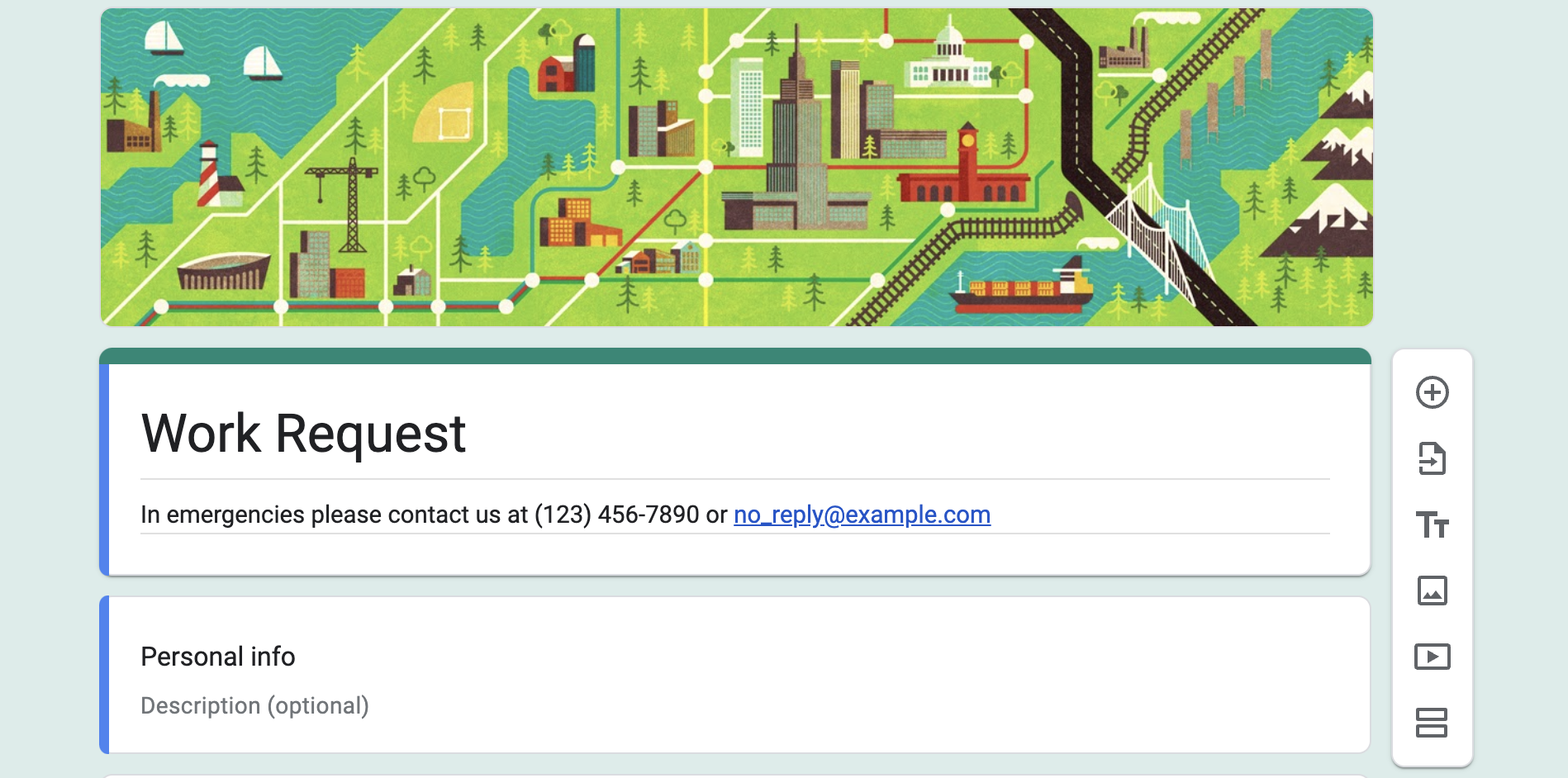
Google Forms lets you choose themes, which is a great starting point for adding a bit of personality to your forms. The right theme can align with your brand or the purpose of your form, setting the right tone from the get-go.
2. The Power of Images
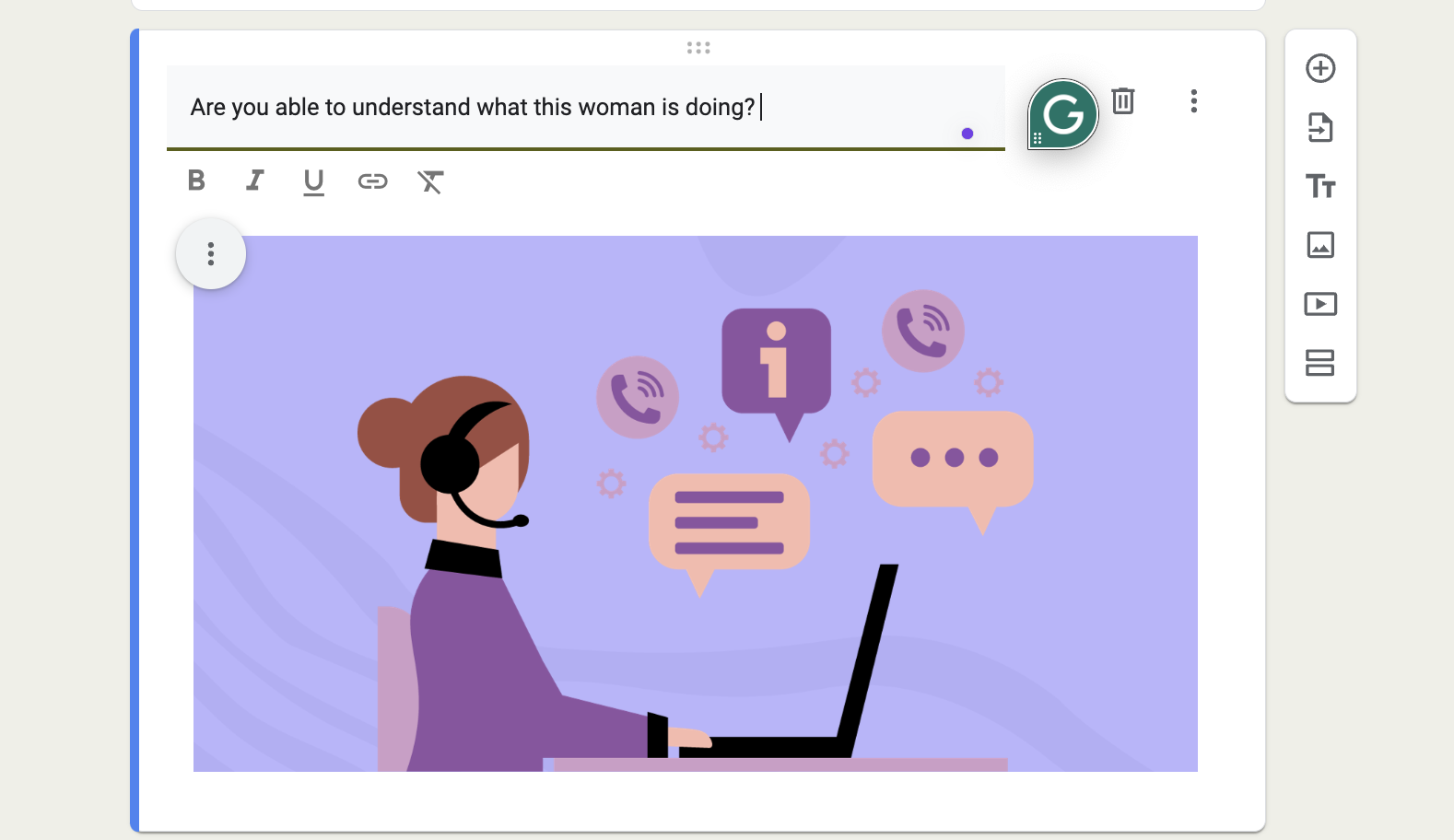
Incorporating images can dramatically change the user experience. Whether setting the stage with a header image or using images within questions, visuals can make the form more engaging and less monotonous.
3. Utilizing Font Styles and Colors
While Google Forms offers limited direct options for customizing fonts and colors, carefully selecting your form’s color scheme and crafting your questions thoughtfully can still make it feel personalized and easier on the eyes.
4. Structuring with Sections & Question Types
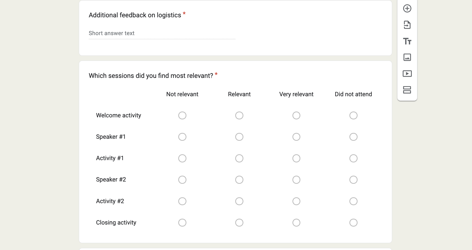
Utilizing sections can significantly enhance the navigational flow of your form. It’s about guiding your respondents through the form in an organized manner, making the experience smoother and more pleasant.
5. Mobile-Friendly Design
Creating a responsive form ensures it is accessible and easy to fill out on any device, enhancing the overall user experience.
6. Use Validation to Collect Better Data
Implementing field validation guarantees that the data collected is accurate and in the correct format, which is essential for quality data collection.
7. Autograde and Lock Your Quizzes
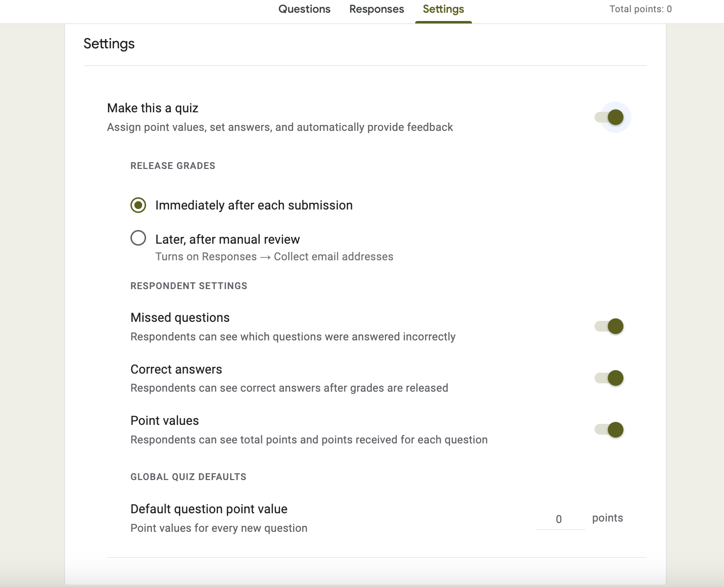
Features like auto-grading and locking submissions for forms serving as quizzes or assessments ensure integrity and provide immediate feedback.
8. Test Your Form
Testing your form with a small group before widespread release can uncover and allow you to address any issues, ensuring a smooth and user-friendly experience for all respondents.
By adopting this structured approach, you’ll enhance both the functionality and aesthetics of your forms, creating a more engaging and effective experience for your respondents.
But hold on…
Get Free Customizations options for your forms with SurveySparrow
What if I told you there’s a way to level up your form game seriously? Imagine adding not just pictures but GIFs, creating simpler features to the survey experience with 1000+ ready-to-use survey templates, and so much more. Sounds like a dream, right?
Well, if you’re searching for a tool that brings all this to the table, let me quickly introduce you to an awesome alternative that can give you that premium survey experience: SurveySparrow.
Here’s a customizable survey template from SurveySparrow that is available for your use at no cost. Please create a free account and see the number of options available to customize the form and make it look really out of the box.
Stranger Things Trivia Quiz
Use This TemplateWould you like to access more free forms like this? Sign up with your email, create a free account, and get free access to 1000+ eye-catching survey templates from SurveySparrow.
14-day free trial • Cancel Anytime • No Credit Card Required • No Strings Attached
When You’re Looking for Customizable Forms, Try SurveySparrow
Now, SurveySparrow has entered the chat for those who want to take things up a notch. It’s like the cool alternative of Google Forms, offering features that transform your standard forms into engaging, interactive experiences.
1. Conversations, Not Forms
SurveySparrow turns the form experience on its head by making it a conversation. Imagine chatting rather than filling out a boring form. Sounds better, right?
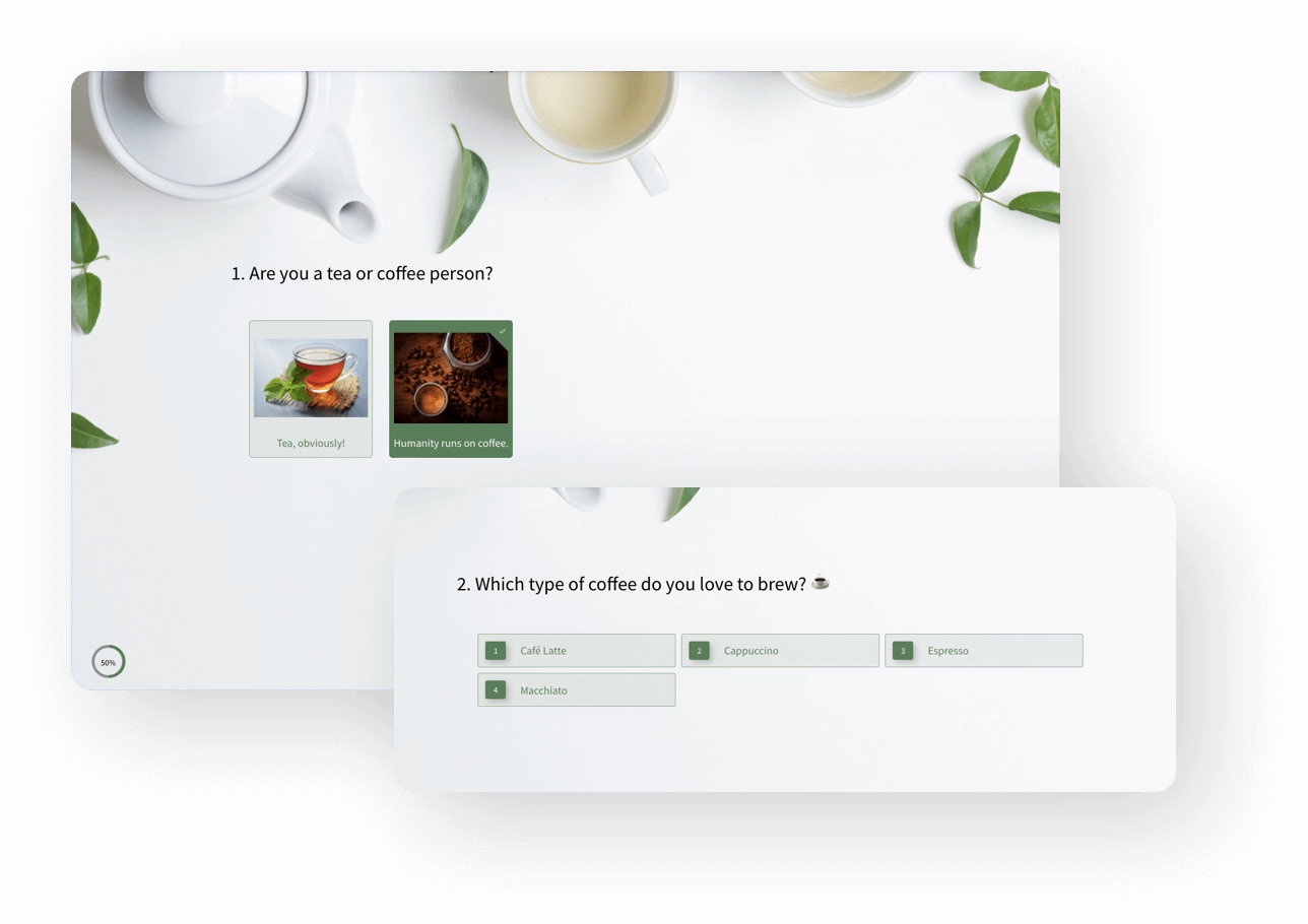
2. Tailor-Made Looks
With SurveySparrow, the sky’s the limit when it comes to customization. From custom CSS to various templates, you can make your form or survey as unique as your fingerprint.
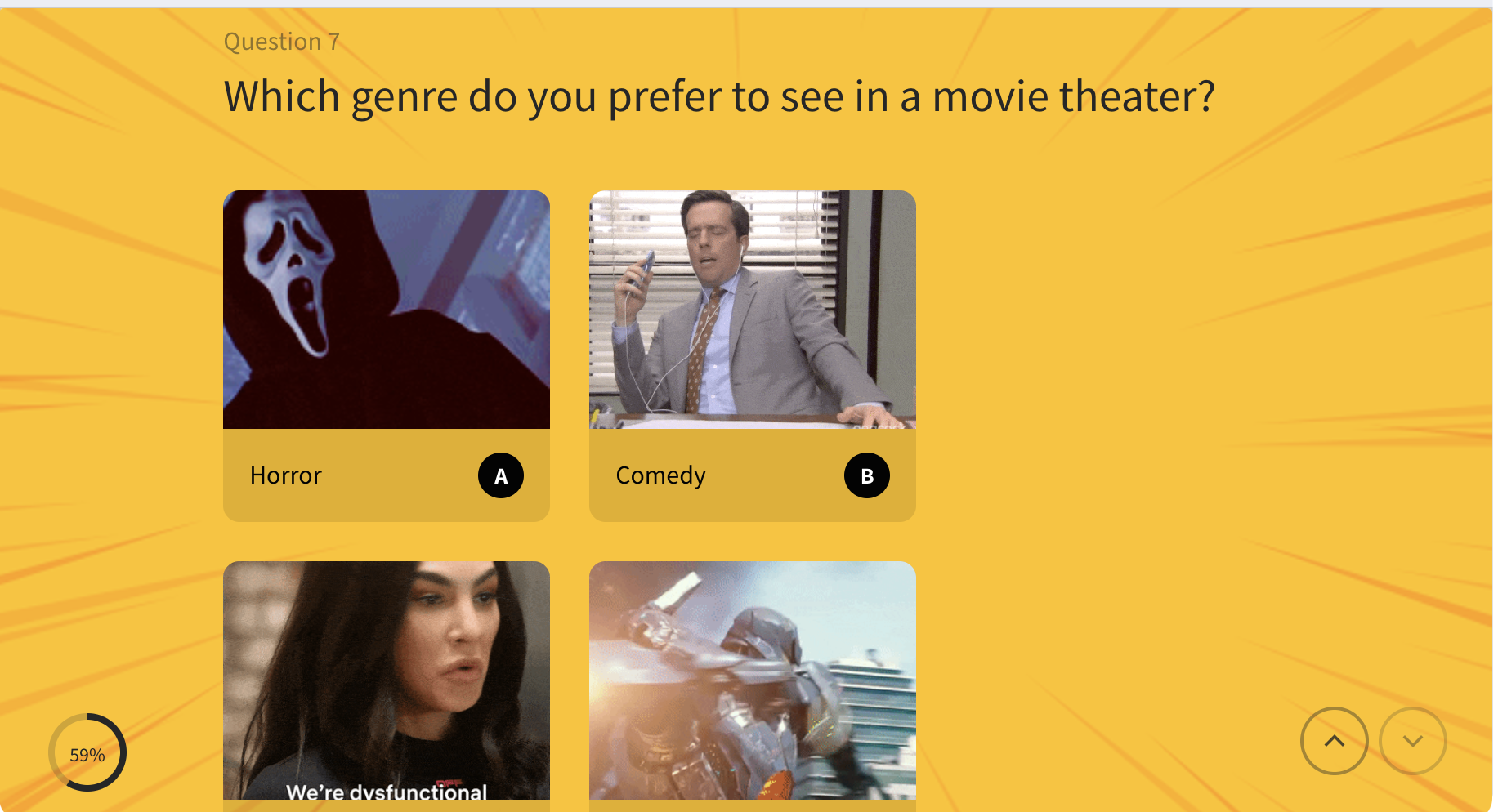
3. Pictures, Videos, and GIFs, Oh My!
Why limit yourself to text and the odd image? SurveySparrow lets you embed videos, GIFs, and more, making your forms a multimedia experience.
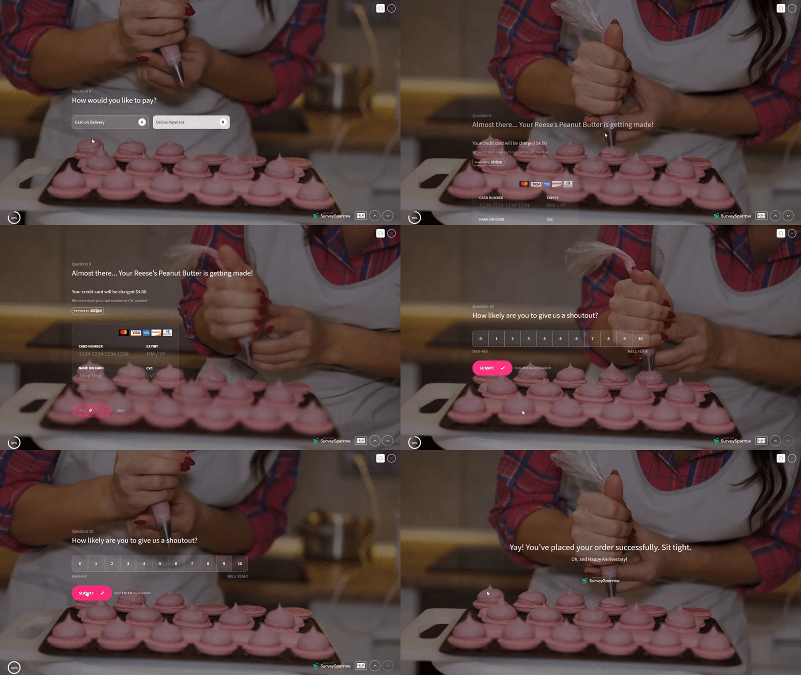
4. Smart Forms for Smart People
Dynamic logic and branching make your forms smarter and more personal. Your form is getting to know your respondents and adapting the conversation accordingly.
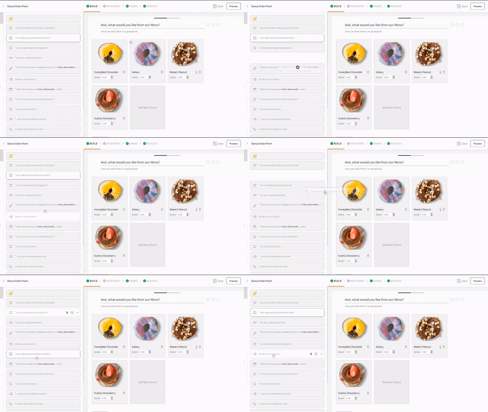
Sign Up for Free & Choose from 1000+ Premade Templates.

Make Exceptional Survey Forms with SurveySparrow for Free
A personalized walkthrough by our experts. No strings attached!
Limitations of Google Forms as a Form Builder
Google Forms is praised for its simplicity and efficiency in surveys, quizzes, and data collection. Yet, its customization options for a more refined, professional look are somewhat lacking. Here’s a brief overview of where Google Forms might not meet the mark for professional aesthetics and customization:
- Limited Theme Options: Basic theme customization is possible, but it falls short for those wanting to match their brand or aesthetic fully.
- Fixed Font Choices: The inability to change font types may not align with your desired professional tone or branding.
- Restricted Layout Customization: Google Forms offers little flexibility in adjusting question layout or form structure for a unique look.
- Basic Media Integration: Only simple image and video additions are allowed, lacking the option for more sophisticated multimedia or custom coding.
- Minimal Branding: Options to incorporate detailed branding elements like logos or custom backgrounds are limited.
- Basic Conditional Logic: While some conditional logic is supported, more complex, nuanced logic might require workarounds.
- Lack of Real-time Feedback: Direct, personalized feedback based on user responses isn’t supported, which could be crucial for professional interactions.
- Basic Submission Confirmation: The confirmation page offers minimal customization, which may not suffice for those seeking a professional finish.
Although Google Forms is a robust tool for many, those seeking deeper design customization and branding might consider alternatives like SurveySparrow.
Wrap Up
So, there you have it! Making your Google Forms look better is doable with a few tweaks here and there. But if you’re looking to dazzle your audience, SurveySparrow might be your ticket to the big leagues.

Make Exceptional Survey Forms with SurveySparrow for Free
A personalized walkthrough by our experts. No strings attached!
Whether you decide to stick with Google Forms or give SurveySparrow a whirl, the most important thing is to create forms that are functional and a joy to fill out. Because, let’s face it, no one likes a dull form. Happy form-making!

Create engaging surveys that people actually complete. Try SurveySparrow now!
Jaby K J
Once chasing a half-cooked Ph.D. dream in Literature amidst the stacks of academia, Jaby has successfully pivoted to become a product marketer in the SaaS industry, leveraging a rich background in research and a deep understanding of creating compelling narratives.
Related Articles

Survey & Feedback
The Ultimate Guide to SMS Surveys (2024 Edition)
9 MINUTES
30 September 2022

Survey & Feedback
Jotform vs Google Forms: Which is Best in 2024?
16 MINUTES
23 May 2022

Survey & Feedback
What Are Questionnaires? Benefits, Types, and Examples
20 MINUTES
12 October 2023

Survey & Feedback
Lead Generation Surveys: The Complete Guide
15 MINUTES
5 July 2021
